Canceling Amazon Prime
I canceled my free Amazon Prime trial recently. I was surprised how many stages this required. Overall this looked like a dark UI pattern.
Process
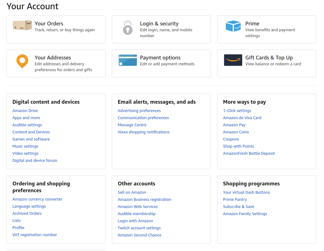
It is non-obvious how to actually cancel the membership.
The main page looks like:
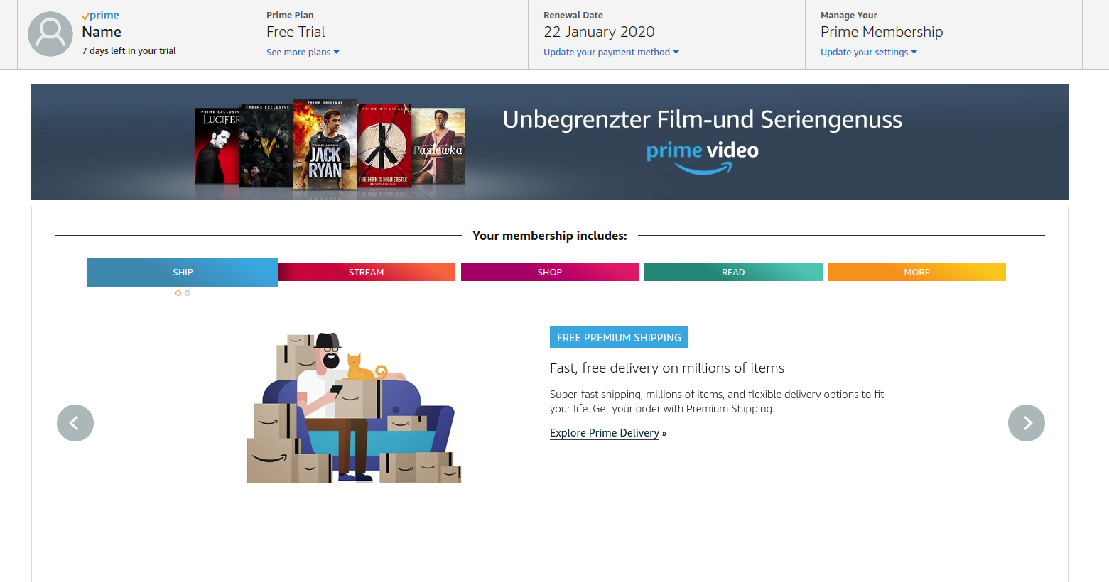
Fortunately there is “Prime” section, let’s go there:
After some trial and error I landed at “Update your settings”:
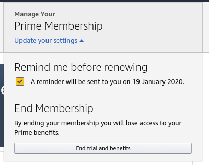
Oh, “End Membership”, now we are talking. It is quite funny that this entire flow tries to tell me that I will lose all the benefits of “Prime” membership by canceling.
However, this is definitely not the end of the story (probably more like a middle point). The next screen gets more pushy and tries to hint me again that I will lose all my “benefits” if I cancel prime:
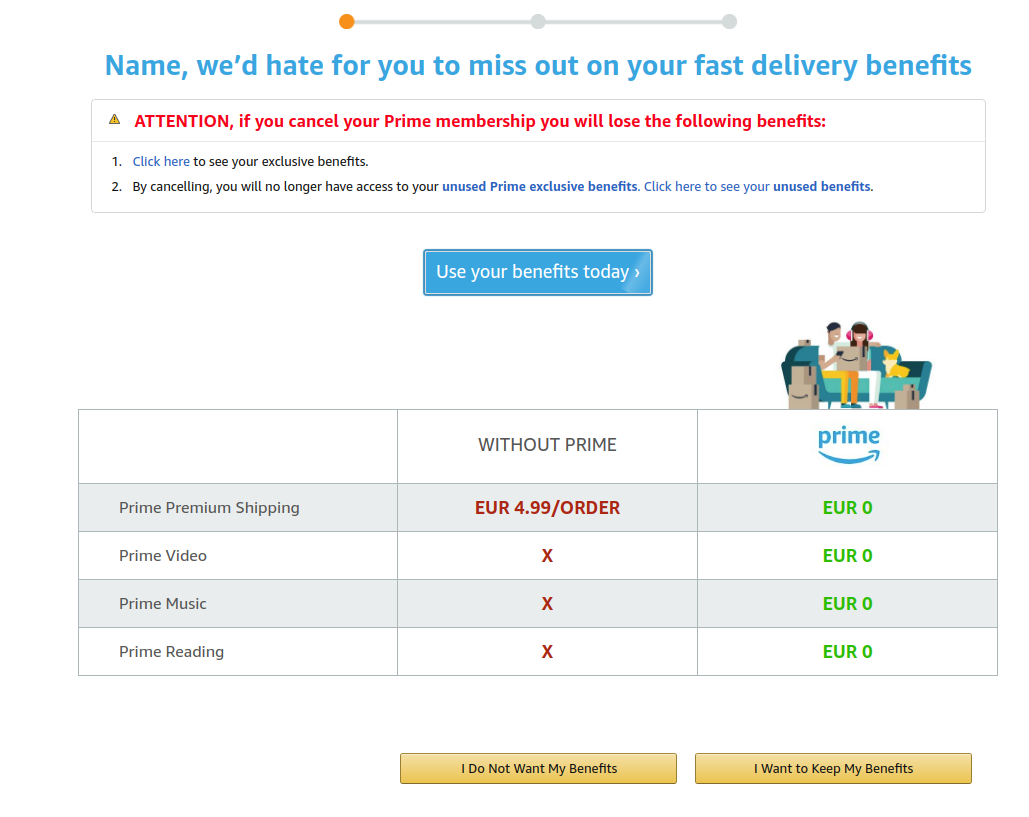
The user is also presented with one bright blue button, which does not lead to cancellation and two very similar yellow buttons - only one of them is the correct one. Funny enough it is not the rightmost one. I think most of the UI teaches the user to click rightmost one. Ok, I increase my attention level to the maximum and click “I Do Not Want My Benefits”:
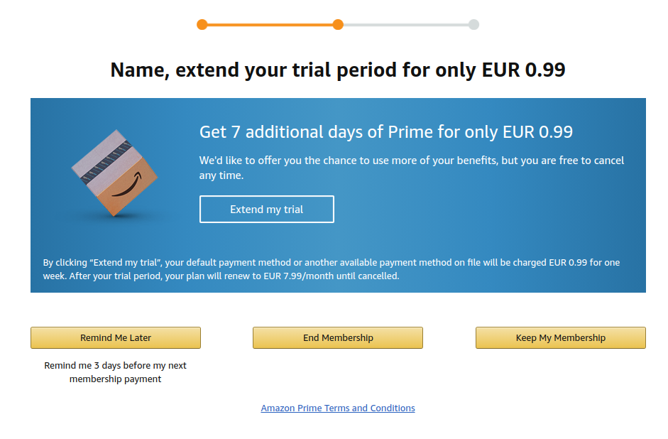
I am pretty sure the though process was like “oh, looks like this guy is pretty serious, let’s use heavy artillery… and offer 7 days of Prime for 0.99 EUR”. WTH? I can’t imagine any use of 7 days of Prime for 0.99 EUR. Again we see nice blue button, which does not lead to cancellation and now 3 yellow very similar ones. Only one of them is the correct button and it is in the middle. At least I am still able to click it:
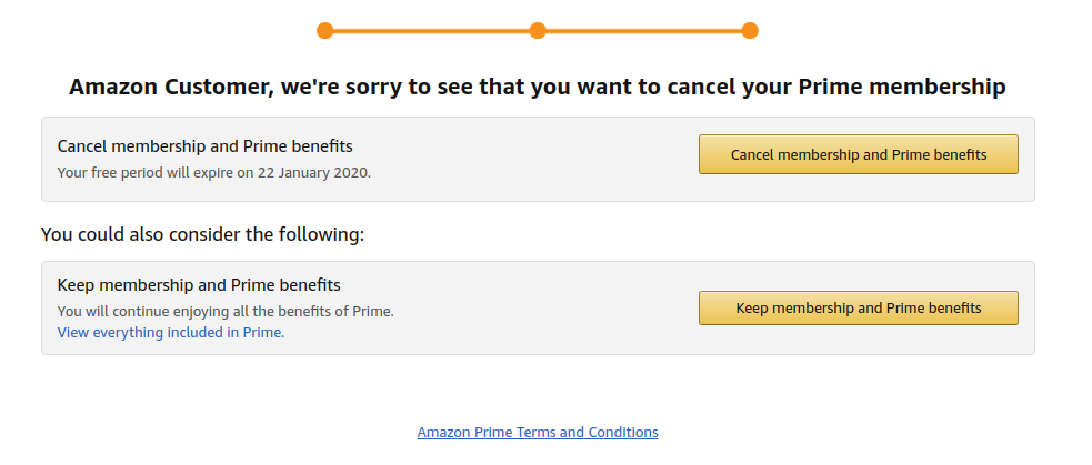
Yet another screen. Again two very similar buttons. The upper one is the correct one. For some reason they changed from horizontal button layout to vertical. I am pretty sure this just adds confusion and leads to a few more people clicking the wrong button by mistake.
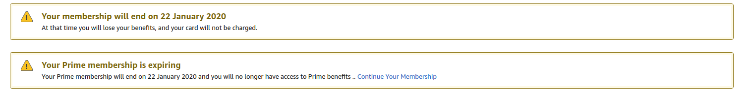
Fortunately, this was the last step (but I already braced myself for more):
Thoughts
I am very curious why they stop at 3 screens and not like 10? I find 3 screens already awkward. Perhaps this is just to “protect a poor user from making a wrong choice” and 10 would be too scammy. Fortunately they don’t require writing a poem in Chinese about why I want to cancel and lose “all the wonderful benefits”.
Happy navigation in dark UIs!